![]() I do!
I do!
Google’s new logo was designed to represent how far they have come as a company and how Google is more than just a search engine. You would think that maybe this means they would go for a more modern look. Wrong.
I love sans serif just as much as the next guy. Actually, I probably love it more than the next guy. If you haven’t noticed, 80% of my September Fonts of the Month are sans serif.
I love Apple’s aesthetic. Minimalist, sophisticated, and contemporary. It’s well-suited for a technology company. Which is what Google is. If they decide to go sans serif, then that is the polished look they should be striving for.
Google’s serif logo was beautiful. It was iconic. They’ve made some retouches over the years to keep up with the trends. It’s had gradients and shadows, and most recently, flat design. This is all good. But now this? When I first saw today’s “Google Doodle,” which showed a hand erasing the old logo and drawing in the new one, I thought it was an announcement of Doodle 4 Google, which is a contest for kids. Then I realized the horrific truth: Google had traded in their classic logo for kindergarten letters. I got really mad. Usually I don’t care that much if a company has a bad logo, but I use Google every day which means I’ll have to see the logo constantly. I might have to switch to Bing!
Below are two alternate logos I designed:
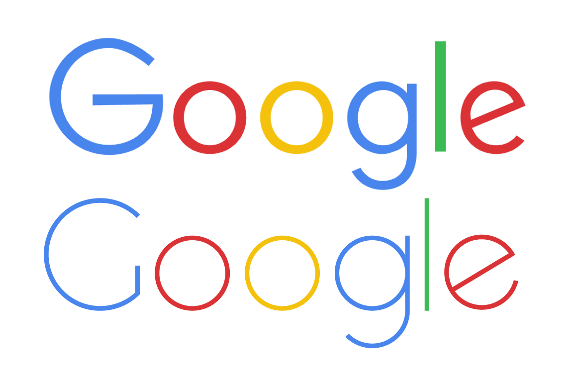
The top one is a different version of the new logo. I made it less bold (the thickness of the letters is what made it so elementary). I made the G look better too.
The bottom one is what I would imagine a sans serif Google logo to look like. I don’t think I like either of my re-designs better than the logo they always had.
The new logo is changing more than just the homepage:
![]()
These dots are the new loading symbols. Not bad.
![]() Here is the little G icon. In this case I like the new one more.
Here is the little G icon. In this case I like the new one more.
![]() They are also changing the Google+ logo. I think the old one is better.
They are also changing the Google+ logo. I think the old one is better.

Here’s what all of Google’s apps look like now.
You can also check out this idea on Mix.
That’s what I think. What’s your take on Google’s logo? Love it, or hate it? Share your opinions in the comments below.

I was shocked when I saw the new logo too! I would expect something better – – but I agree, why change something iconic? Great post!
LikeLike
Maybe they should just change their name to “Goo goo”, slap a pacifier icon inside one of the O’s and be done with it.
LikeLike
This post is brilliant. I agree that Google’s new font is lame.
They lost their oogle factor. I LIKE YOUR ALTERNATE LOGOS BEST.
LikeLike